top of page

eCommerce Redesign & Marketing Campaign
eCommerce redesign for Greyhound, Albertsons, Enterprise, and more

PROJECT SUMMARY
As a UX Design Intern at Image Solutions, I redesigned and rebuilt our e-commerce site to help customers find items quicker and increase checkout rates.
+6%
Projected eCommerce
Revenue
-30%
Reduced clicks to
complete checkout
WCAG
Redesigned site to meet
Web Content Accessibility Guidelines
Tools Used

OVERVIEW
In the summer of 2024, I had the privilege of interning as a UX designer at Image Solutions, a company which designs, manufactures, and distributes uniforms for a wide variety of clients across multiple industries.
Clients Served

CHALLENGE
Using data collected from Google Analytics, I determined some pain points for the users. People were struggling to finish the checkout process, with a significant portion of users dropping off every step of the way. Two glaring numbers stood out:
53%
of users who logged onto the site did NOT view an item
43%
of users who added items to
the cart did NOT checkout
PROBLEM STATEMENT
How might we help employees find the uniforms they need and get them to check out as quickly and easily as possible?
DESIGN PROCESS
The solution was designed in Figma, where I improved upon a template that the team had already purchased and partially implemented.
1. I began with a thorough audit of the template to identify useful features and areas that created friction.

2. After features from the template were selected, I streamlined the template to include only features that were useful. Features such as reviews, sales, and countdowns were removed, as our site didn’t track those.

3. Next, I mocked up what the template could look like once it was color-themed for executive review.
4. I led building the new site using HTML, CSS, JavaScript, C#, and SQL. The final build is below.
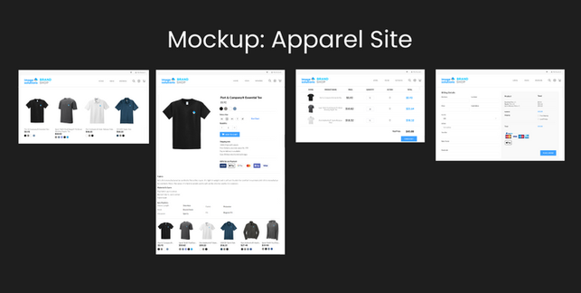
SOLUTION
Changes were made to virtually every page of the base site, which is used for all 30 clients. The highlights are shown below, with the Image Solutions company merch site being used as an example.
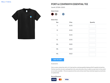
Information Transparency
Adding price and color give users more confidence in selecting the correct item
.png)
Before
After


Facilitating Exploration
New "recommended item" section allows customers to find items quicker
Before
After

Clarity and Simplicity
Replaced item numbers with clear product descriptions and added a prominent call-to-action to direct user flow.
Before
After

Improved Navigation
Reduced clicks to complete desired action
Before

After

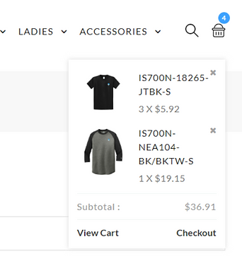
Customer Re-Engagement
Created email reminders to nudge customers to checkout items they left in their cart

CONCLUSION
With Image Solutions selling so many different kinds of items for so many different clients, it was a challenge to design the site in a way that would translate well for all types of products.
The site redesign, combined with integration of the email reminders boosted sales $50k within a week of the re-marketing launch. As Image Solution’s first-ever design intern, I was honored to have the opportunity to make an impact in my short time here.
bottom of page